Jump to: CLASS REGISTRATION | HEALTHCAROLINA | COVID-19 SIMULATOR | TEXT MESSAGE ANALYSIS

Class Registration

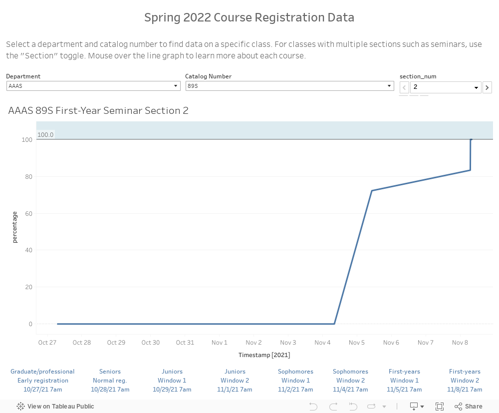
Inspired by the Daily Bruin's "How quickly do classes fill up?", I created a Python tool to scrape class information from Duke's student information system, DukeHub, periodically for about an hour each day during registration. (I later learned that Duke has an API for class offerings already.)


HealthCarolina

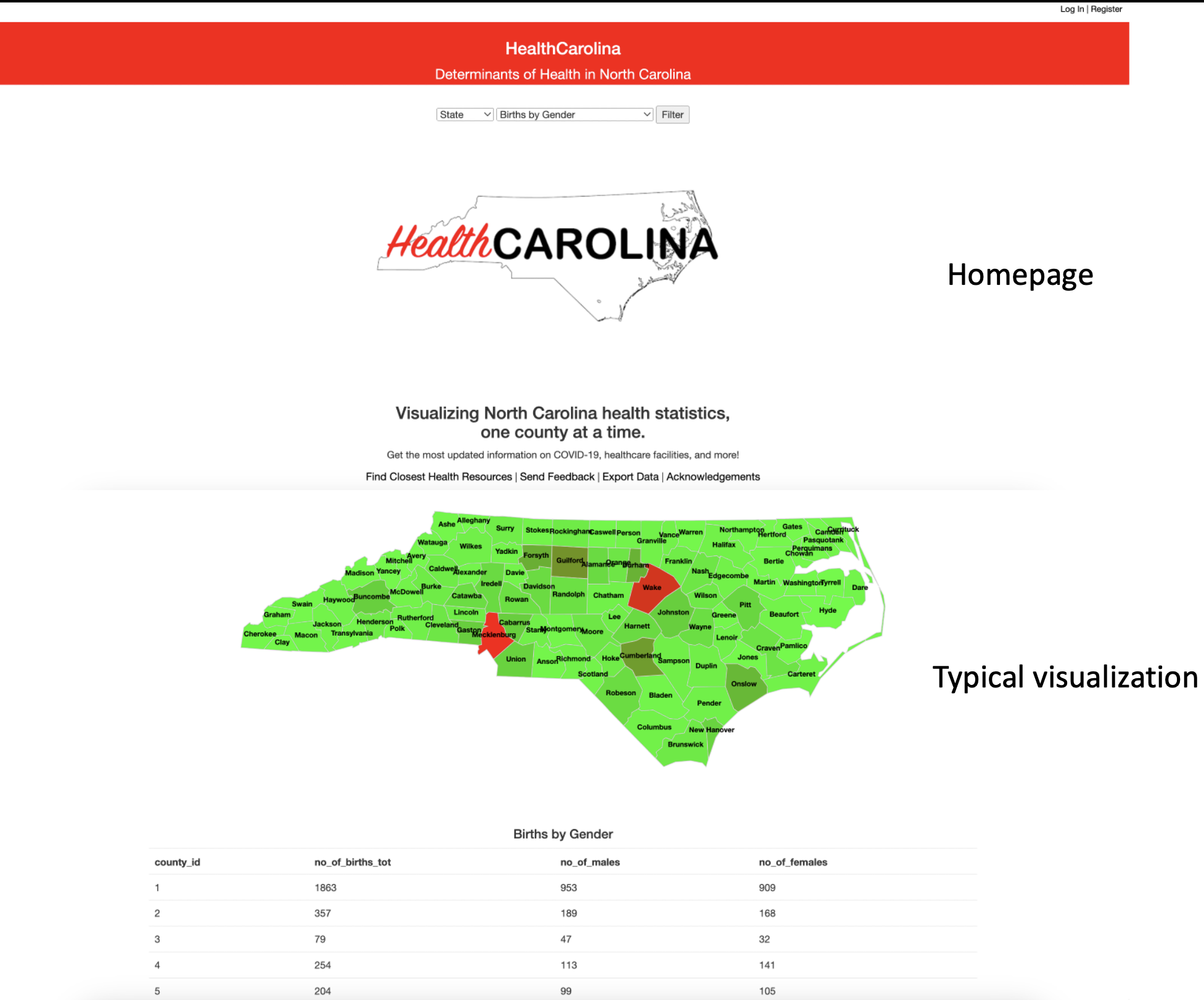
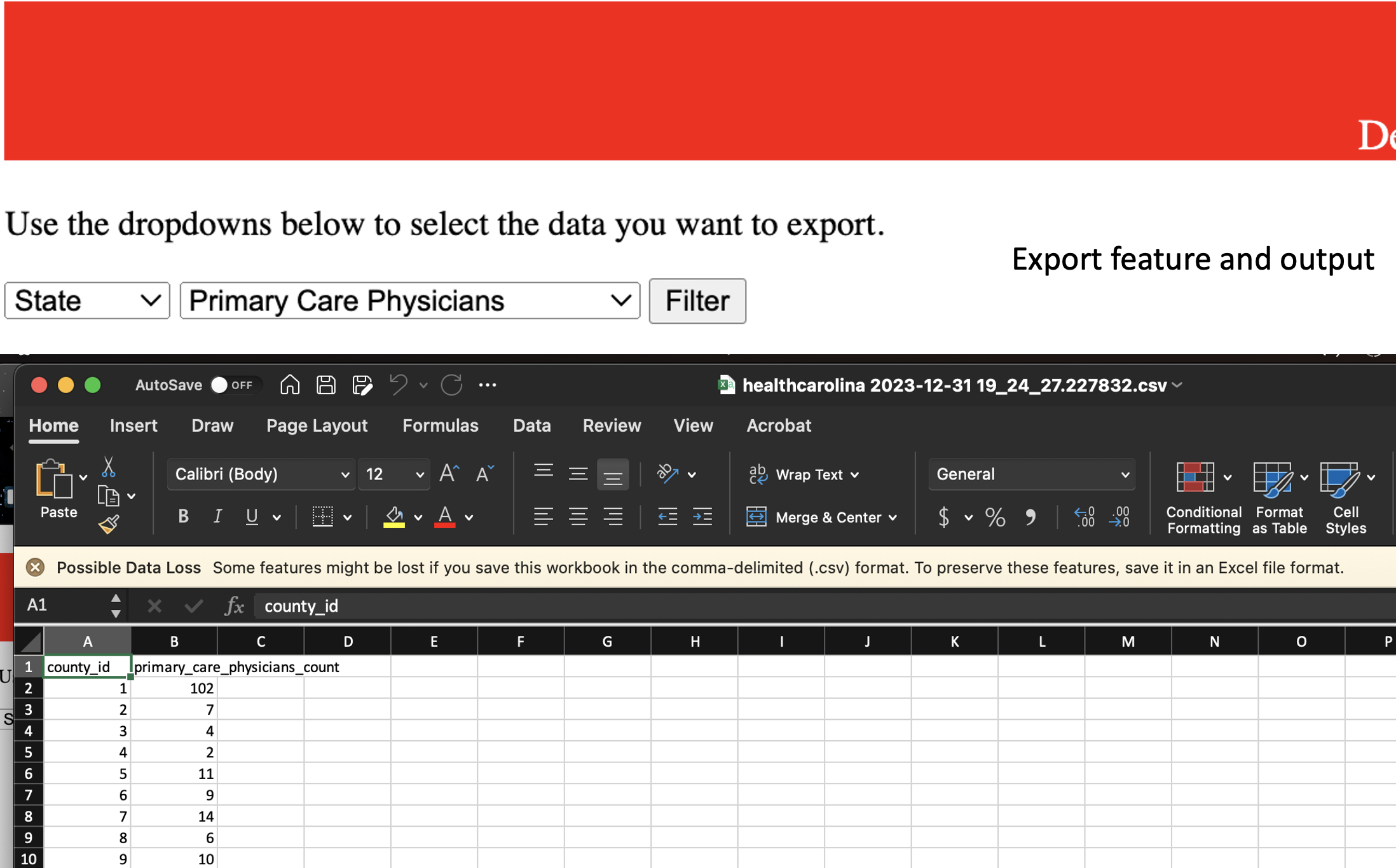
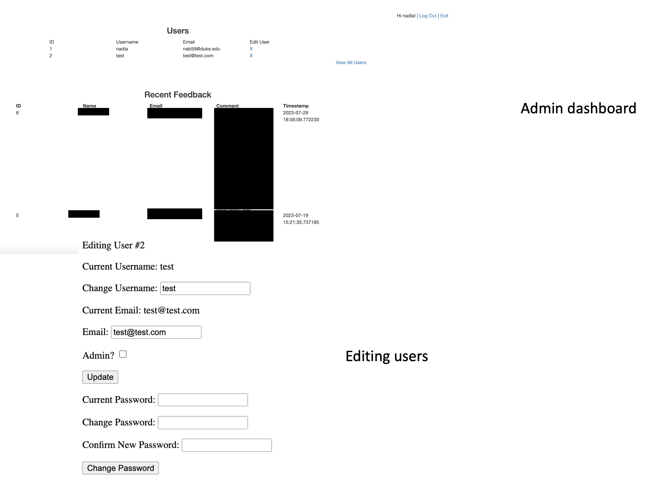
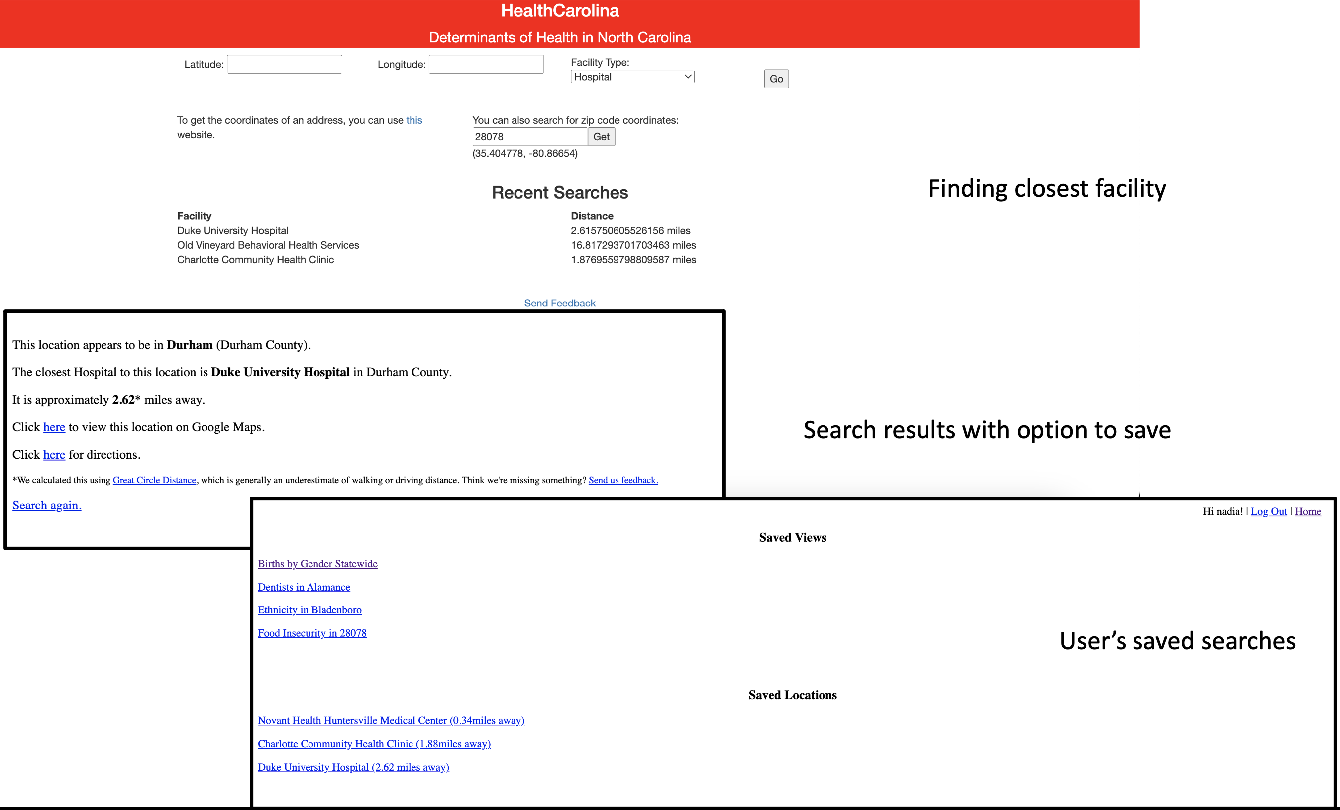
Over the course of the fall 2021 semester, I developed a website to display North Carolina health statistics at the county level for my Database Systems class. In addition to generating visuals, the website could also calculate the nearest health facility available in the database. After the course ended, I updated the website to make it more user-friendly, with the option to create an account, save search results and make changes via an admin dashboard.

Two screenshots of HealthCarolina. The first screenshot is the homepage. The second screenshot labeled 'Typical visualization' shows a red and green chloropleth map of North Carolina representing births by county, with red areas (in this case Mecklenburg and Wake Counties) having higher birth rates.

Two screenshots, one of HealthCarolina's export page and one of Microsoft Excel showing the output.

Screenshots of the HealthCarolina admin dashboard showing user information and recent feedback submissions with timestamps, and the edit user functionality for admins.

Screenshots showing HealthCarolina's closest health facility functionality, a sample search result showing the distance to Duke University Hospital with links to directions, and user's saved search results.


COVID-19 Simulator
I adapted a SIR model developed by Duke researchers into an interactive tool that takes user input and generates a randomized graph showing infection rates.


Text Message Analysis
I wrote a Python script to analyze my text messages, which were stored in a db file on my Macbook. The script calculates how many messages I exchanged with a particular contact, which emojis and reactions I used most frequently, and how often I "double texted" before getting a response and vice versa. The analysis shown in the below images includes messages between December 24, 2020 and December 30, 2021.